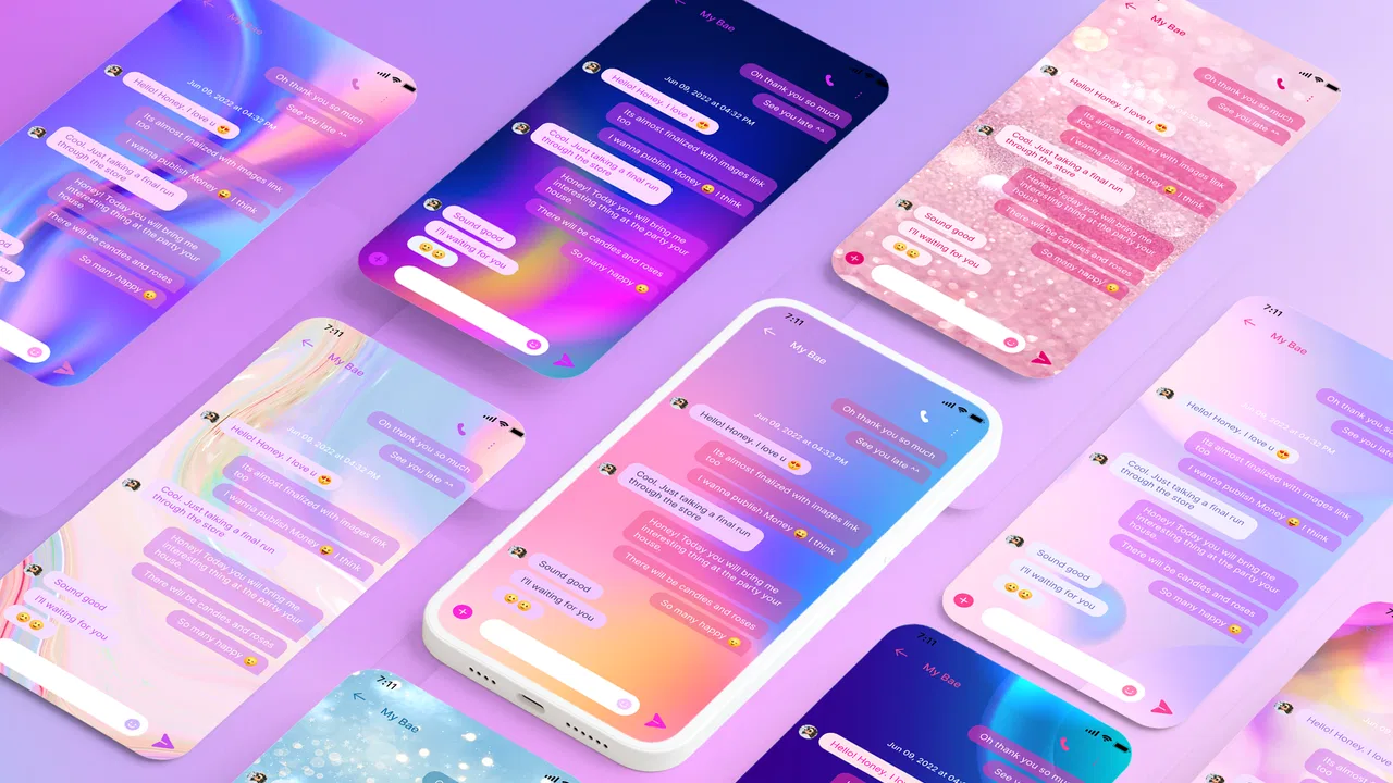
Messenger - Color SMS
- 4.3
- Rating
- 10.00M
- Installs
- Free
- Price

 Analysis by App-foxy
I spent time using Messenger - Color SMS as a communication app rather than treating it as just another visual customization tool. Its main appeal is simple: it lets you make everyday messaging feel more personal through colorful themes, chat styling, and expressive design choices. That sounds modest, but it changes the mood of an app I might otherwise open dozens of times a day. If plain message screens feel dull to you, this is a more playful alternative to the standard texting experience.
My overall impression is positive, with an important qualification: this is best understood as a style-focused messaging app, not a complete replacement for every communication service. It is free to install, suitable for Everyone, and developed by Maxlabs Personalization Tools. The app has built a 4.3 average from around 42 thousand ratings and passed over 10 million installs, so it is clearly not an obscure experiment. Still, popularity does not remove the need to decide whether its visual approach fits the way you actually communicate.
How the current Messenger - Color SMS experience feels
The first thing I noticed is that the app puts personality ahead of minimalism. Instead of presenting messages in a strictly functional layout, it gives attention to colors, themes, and the general atmosphere of a conversation. That makes a difference when I want a chat with a friend to feel less formal, or when I simply want my messaging screen to look more like my own phone rather than a default system utility.
You May Also Like

 Blood Strike: 2.5 Anniversary
Blood Strike’s Loadouts Turn Every Drop Into a Tactical Gamble
A close look at Blood Strike’s custom loadouts: how fast access to signature weapons reshapes its battle royale rhythm, rewards preparation, and narrows the gap between fights.

 Pandora - Music & Podcasts
Pandora’s Music Is Easy to Start, but Harder to Recover
Pandora’s strength is its low-effort path from a seed to a station. Its weak spot is how much confidence it asks you to place in connection, setup, and quiet recovery.

 8 Ball Pool
 Is Built on Rivalries, Rematches, and Routine
A close look at the rivalries, rematches, shared routines, and unanswered safety questions that turn a quick pool match into a persistent mobile community.

 Samsung Music
’s Quiet Strength Is Playing What You Already Own
Its reach comes less from spectacle than from dependable access to a personal library. That simplicity is both the app’s strongest retention engine and its ceiling.

 AccuWeather: Weather Radar
AccuWeather Review: A Quick, Clear Forecast for Everyday Decisions
For everyday plans, the best forecast is the one you can understand quickly. AccuWeather makes rain timing, radar, and local conditions easy to act on, with a few trade-offs.

 Hill Climb Racing
Why Hill Climb Racing Still Turns Crashes Into One More Run
A tiny car, a bumpy hill and one more upgrade: Hill Climb Racing keeps resurfacing because its simple chaos makes every near-miss feel personal.
More From Our News Desk



The strongest use case is someone who sends ordinary SMS messages but dislikes the visual limitations of the phone’s built-in messenger. You do not need to be a heavy social-media user or a designer to appreciate the idea. A few changes in color and presentation can make familiar conversations easier to distinguish at a glance, especially when several chats otherwise look nearly identical.
I also found the concept useful for separating moods. A bright, energetic style can suit casual conversations, while a calmer theme may be more comfortable for family or work-related messages. I would not call this a productivity feature, but visual separation can reduce the small amount of mental effort involved in scanning a busy inbox. The benefit is subtle rather than dramatic, yet it is one of the reasons the app feels more practical than a simple novelty.
That said, the experience is not aimed at people who want the cleanest possible interface. If you prefer a restrained design, maximum consistency with Android’s system apps, or a messaging screen that disappears into the background, the extra styling may feel unnecessary. The app’s identity is built around visible customization, so users who dislike decorative interfaces should think twice before switching.
A realistic everyday scenario
Imagine that I am waiting for a delivery update while also exchanging messages with a family member and arranging plans with a friend. In a conventional messenger, those conversations may blend together visually. With a more expressive setup, I can make the overall inbox easier to read by giving the app a distinctive look and using the visual language to make conversations feel less interchangeable.
The important point is not that colors magically organize everything. They do not replace search, careful naming, or sensible notification habits. The advantage is that the app adds a quick visual cue to an activity that is usually presented as a flat list. For people who remember information visually, that can make the daily messaging routine feel more manageable.
Another practical situation is sharing a phone with a strong personal preference for appearance. Rather than changing the entire device theme, I can focus on the messaging environment I use most often. That narrower approach is convenient because it gives the customization a clear purpose instead of turning every part of the phone into a design project.
What the developer’s update path suggests
Messenger - Color SMS is currently at version 2.14.0, and it was released on December 16, 2020. Those details place the app in the category of an established product rather than a brand-new messaging experiment. In my view, the current version matters more than the original release date: a mature app has had time to refine its central idea, but it may also carry design decisions that newer tools would approach differently.
The evolution is most visible in the fact that the app remains focused on its original identity instead of trying to become an all-purpose social platform. Its direction is clear: messaging first, personalization second, and visual expression as the reason to choose it over a plain alternative. I prefer that focus to an app that adds unrelated features simply to appear larger.
At the same time, version numbers alone should not be treated as proof that every part of the experience has changed dramatically. I would judge the update history by whether the interface feels stable, whether customization remains easy to use, and whether the app continues to work comfortably on supported devices. The minimum requirement is Android 7.0, which makes it accessible to many older phones as well as more recent models.
How it compares with ordinary messaging tools
The built-in messaging app on a phone usually wins on familiarity. It is already installed, tends to match the device’s design language, and may feel more predictable when I need to send a quick message without thinking about presentation. If reliability and simplicity are my only priorities, the default option can remain the better choice.
Messenger - Color SMS wins when appearance is part of the experience. It gives me a reason to open a separate messaging app: not because basic texting suddenly becomes a different form of communication, but because the interface feels more expressive. That is a meaningful distinction from internet-based chat platforms, where the main attraction is often group communication, media sharing, stickers, or a broader social network.
I would not choose this app as a direct substitute for a service built around large online communities or feature-rich encrypted conversations. Its appeal is closer to customizing the room in which a conversation happens than changing the entire communication system. For standard SMS habits, that can be enough. For users who expect advanced online-chat functions, it may feel limited.
There is also a trade-off between character and consistency. A custom visual style can make the app more enjoyable, but it may not blend as neatly with the rest of the phone. Anyone who switches often between messaging tools may notice that the experience is less uniform. I consider that a fair exchange for personalization, but it should be a deliberate choice rather than an accidental surprise.
Small workflow choices that improve the experience
My first tip is to start with one visual change instead of redesigning everything immediately. A strong theme can look appealing in a preview but become tiring after several days. I get a better result by choosing a style that remains readable in short conversations and does not compete with the message text.
My second tip is to judge a theme under different lighting conditions. A design that looks comfortable in a bright room may feel harsh at night, while a darker style can make text harder to scan during the day. Since messaging is often done in quick bursts, readability matters more than the initial visual impact. The best customization is the one that stays comfortable after the novelty fades.
A third useful habit is to treat customization as a way to support recognition, not as a substitute for organization. I still keep conversation names clear and avoid relying on color alone to identify an important thread. This is especially relevant when I am moving between personal and practical messages. The app can make the interface more distinctive, but my own message-management habits still do most of the organizational work.
I would also test the app with the conversations I actually have rather than judging it from a single sample chat. A style that looks excellent with short messages may be less comfortable when a conversation contains long blocks of text. Likewise, expressive colors may suit casual exchanges but distract from appointment details or addresses. The right test is a normal week of use, not a quick glance.
Where the experience still has friction
The biggest limitation is that visual customization cannot fix every weakness associated with messaging. It does not automatically make conversations more private, does not guarantee that every contact uses the same app, and does not turn SMS into a modern online-chat platform. If those are the features I care about most, I should look elsewhere rather than expecting a theme-based messenger to provide them.
There is also a learning curve, although it is not severe. People accustomed to the default messenger may need a little time to understand where the appearance options fit into their routine. The app is approachable, but a choice-heavy customization experience can create unnecessary friction if I only want to send a message quickly. I would rather have a few well-chosen options than spend too long adjusting details that I will barely notice later.
The free price makes trying it easy, but in-app purchases range from $4.99 to $49.99 per item. That does not automatically make the app poor value; it simply means I would inspect what is included before paying for additional personalization. For me, a purchase is worthwhile only if I expect to keep the chosen style for a long time. Someone who changes themes frequently may find that the cost adds up without improving the underlying communication experience.
Another consideration is emotional rather than technical. A highly colorful messenger may be enjoyable for personal conversations but feel out of place when I use the same app for serious or professional messages. That does not make the design wrong, but it narrows the audience. Users who need one neutral interface for every context may prefer a conventional messenger with fewer stylistic decisions.
Who should install it, and who should skip it?
I recommend Messenger - Color SMS to people who use SMS regularly, enjoy customizing their phone, and want their conversations to have more visual character. It is particularly suitable for someone who finds default interfaces bland but does not need a large social platform. The Everyone age rating also makes the app broadly approachable, although individual preferences about colorful design will matter more than age.
It is a good fit for users who enjoy experimenting with appearance but still want a familiar messaging purpose. The app does not ask me to rebuild my social life around a new network. Instead, it changes how a common task feels. That lower commitment makes it easy to try, keep, or remove depending on whether the visual difference genuinely improves daily use.
I would skip it if I want advanced collaboration, a strictly businesslike design, or a communication service whose main strength is online groups and media sharing. I would also stay with the phone’s default messenger if I rarely send texts and have no interest in customization. In that case, the extra visual layer may add more decisions than value.
People who are careful about spending should explore the free experience first and decide whether the available design options are enough. The app is free to download, but the presence of paid items means I would not assume every attractive customization is included. My approach would be to use it normally for several days, check whether I still enjoy the interface, and only then consider spending money.
Questions worth answering before switching
Will it work on an older Android phone? The listed minimum is Android 7.0, so the compatibility range includes devices that are not recent. That is useful for anyone who wants a personalized messenger without replacing an older phone, although the actual feel can still vary with the device’s screen and general performance.
Is it suitable for someone who wants a completely free experience? Yes, it can be installed without an upfront price, but optional purchases are part of the model. I would treat the free version as the trial and make any payment only after confirming that the customization is something I will continue using.
Does it replace every other chat app? No, and I do not think it should be judged by that standard. Its strength is giving ordinary messaging a more personal appearance. If my conversations depend on features outside that purpose, I would keep a more capable online-chat service alongside it rather than forcing this app to do a job it was not designed to own.
Is the visual design useful or merely decorative? It is both, depending on the user. For me, visual distinction can make the inbox feel more approachable and help separate the mood of different conversations. But the benefit remains secondary to readable text and a smooth routine. If the styling makes messages harder to scan, the customization has stopped being useful.
Should I expect every update to transform the app? I would not. The current version shows that the product is maintained as an established messaging tool, but its central promise remains focused. I would watch for improvements that make themes easier to manage, keep text readable, and reduce the effort of switching styles. Those changes would matter more to me than a long list of unrelated additions.
My recommendation after using it
Messenger - Color SMS succeeds because it gives a familiar activity a recognizable personality. I enjoyed the way a customized interface made routine conversations feel less anonymous, and I can see why the app has attracted a large audience. Its version 2.14.0 release represents a mature point in a product that has been around since 2020, while the continued focus on themes keeps the experience easy to understand.
My recommendation is positive but specific: try it if the look and feel of your messaging app genuinely matters to you. Start with a readable style, use it across real conversations, and resist paying for more customization until the free experience has earned a place in your routine. If you need a neutral, highly integrated, feature-heavy communication tool, the usual alternative may serve you better.
In the end, I see it as a thoughtful personalization layer around everyday texting rather than a universal messenger. That is not a weakness when the goal is clear. Choose it for expressive SMS customization, not for features that belong to a different kind of chat platform. For the right user, that focused choice makes the app enjoyable; for everyone else, the default messenger will probably remain the simpler answer.
FAQs for Messenger - Color SMS
01What is Messenger - Color SMS, and what can I use it for?
Messenger - Color SMS is a text messaging application designed to make standard SMS and MMS conversations more colorful and personal. After installing it, you can typically use it to send and receive messages, organize conversations, personalize chat backgrounds or themes, and add visual touches such as emojis. Its main purpose is to provide a more attractive alternative to the default messaging app, although supported features can vary by device, carrier, and Android version.
02Does Messenger - Color SMS require an internet connection to send messages?
The app is primarily intended for SMS and MMS communication, so basic text messages generally use your mobile carrier’s messaging service rather than Wi-Fi or mobile data. However, MMS messages, media sharing, advertisements, backups, optional online features, and app-related content may require mobile data or an internet connection. Standard carrier charges can still apply, so it is important to check your mobile plan before sending many messages or multimedia attachments.
03Can I make Messenger - Color SMS my default messaging application?
On compatible Android phones, Messenger - Color SMS may be selected as the default SMS application. Doing so allows it to handle incoming and outgoing text messages instead of the phone’s preinstalled messaging tool. Android normally requests permission before changing the default app, and you can switch back through system settings. Compatibility may differ between manufacturers, Android versions, and devices with heavily customized software.
04What permissions does Messenger - Color SMS need, and should I be concerned about privacy?
A messaging app commonly requests access to SMS messages, contacts, phone functions, notifications, and storage or media files so it can display conversations, identify senders, send messages, and attach photos. You should review the permission prompts carefully and allow only access that is necessary for the features you intend to use. Also check the app’s current privacy policy and Google Play listing, because data practices and permissions may change with updates.
05Is Messenger - Color SMS free to download and use?
Messenger - Color SMS may be available as a free download, but free access does not necessarily mean that every feature is completely cost-free. The app may include advertising, optional purchases, premium customization tools, or other monetized features. In addition, SMS and MMS messages are billed according to your mobile carrier’s plan, not by the app itself. Review the store listing and in-app purchase information before downloading or subscribing.
Pros
- Bright themes make ordinary SMS conversations feel more personal.
- The interface is easy to understand for first-time users.
- Useful customization options help match the app to your style.
- Works well for users who mainly need basic text messaging.
- Conversation colors make important chats easier to recognize quickly.
Cons
- It may require SMS permissions that some users consider sensitive.
- Advanced messaging features can vary depending on carrier support.
- Extra visual features may feel unnecessary for minimalist users.
- The app may use more battery than a standard messaging client.
- Compatibility with some devices or Android versions may be limited.

Messenger - Color SMS
Gallery